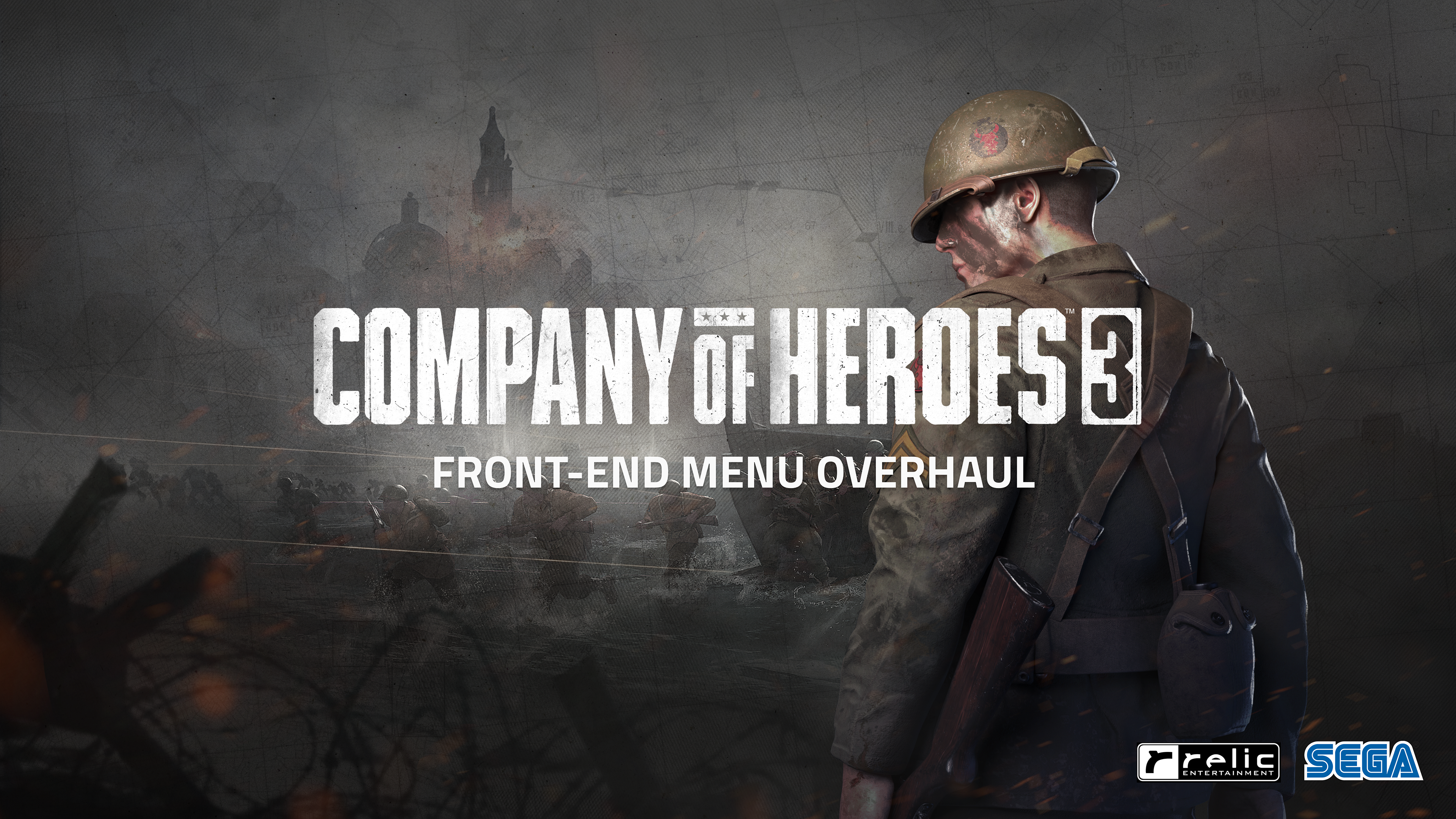
COMPANY OF HEROES 3
FRONT-END MENU OVERHAUL
FRONT-END MENU OVERHAUL
ROLE
Lead UX Design
Lead UX Design
CHALLENGE
Post-launch, under the Art Director's guidance, I led a team of UI Engineers, Tech, and UI Artists to enhance the Front-End (FE) UI, a game aspect previously criticized in reviews. Despite the lack of a defined UIUX workflow and component library, we overhauled the entire game's UI in just four months. A major contributor to this success was the introduction of a new Figma UI Component library and more defined UIUX workflow.
RESULTS
As part of the significant updates in the 1.4 Steel Shepherd Patch, the revamped Front-End (FE) Menu played a pivotal role in meeting players' expectations. It offered a more immersive and authentic World War II aesthetic, paired with improved consistency and usability fixes. This transformation effectively addressed the previous concerns, resulting in an instant positive shift in player sentiment and acceptance around the UI Menus. A major contributor to this success was the introduction of a new Figma UI Component library and more defined UIUX workflow.
Community Sentiment & Feedback
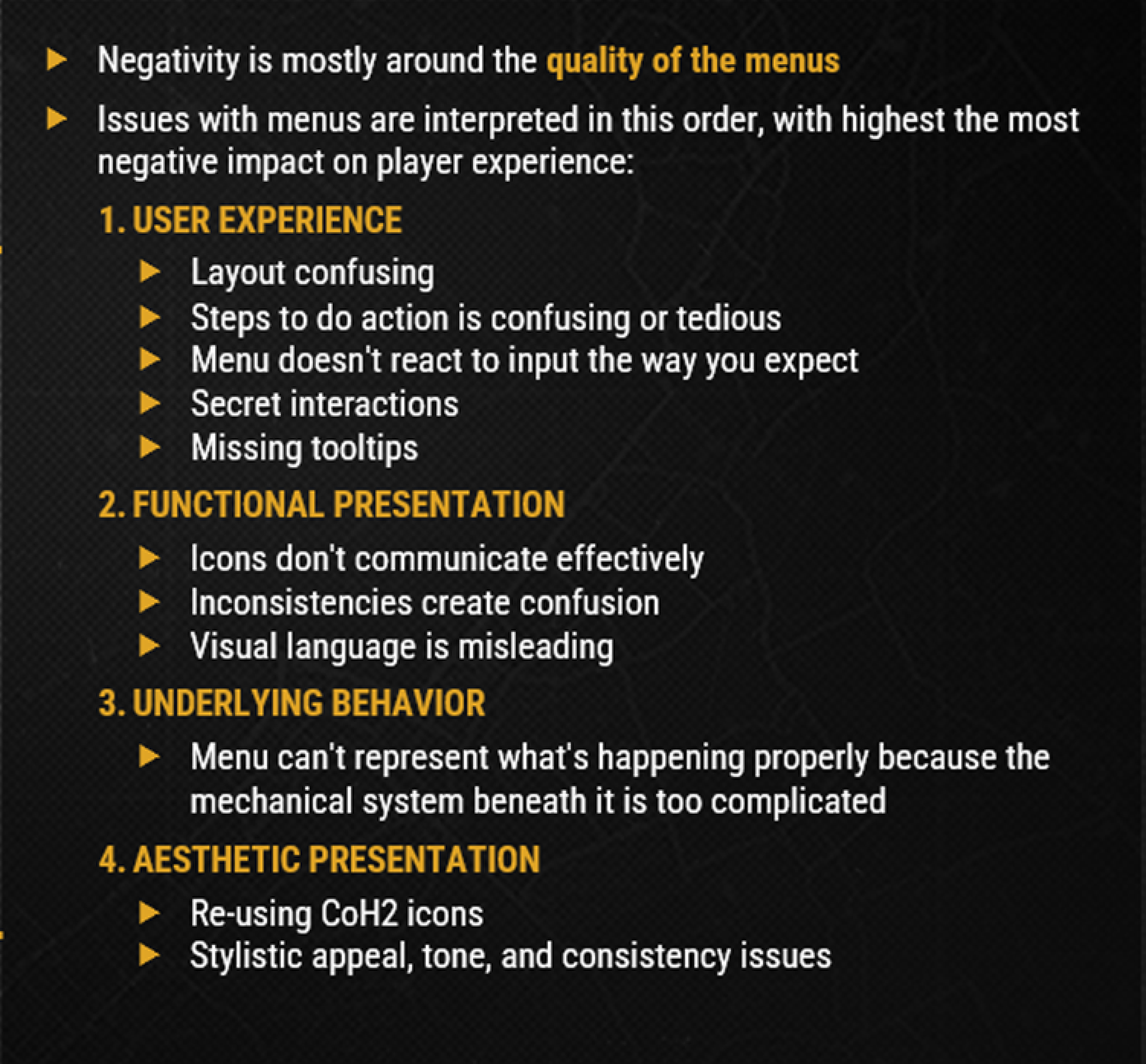
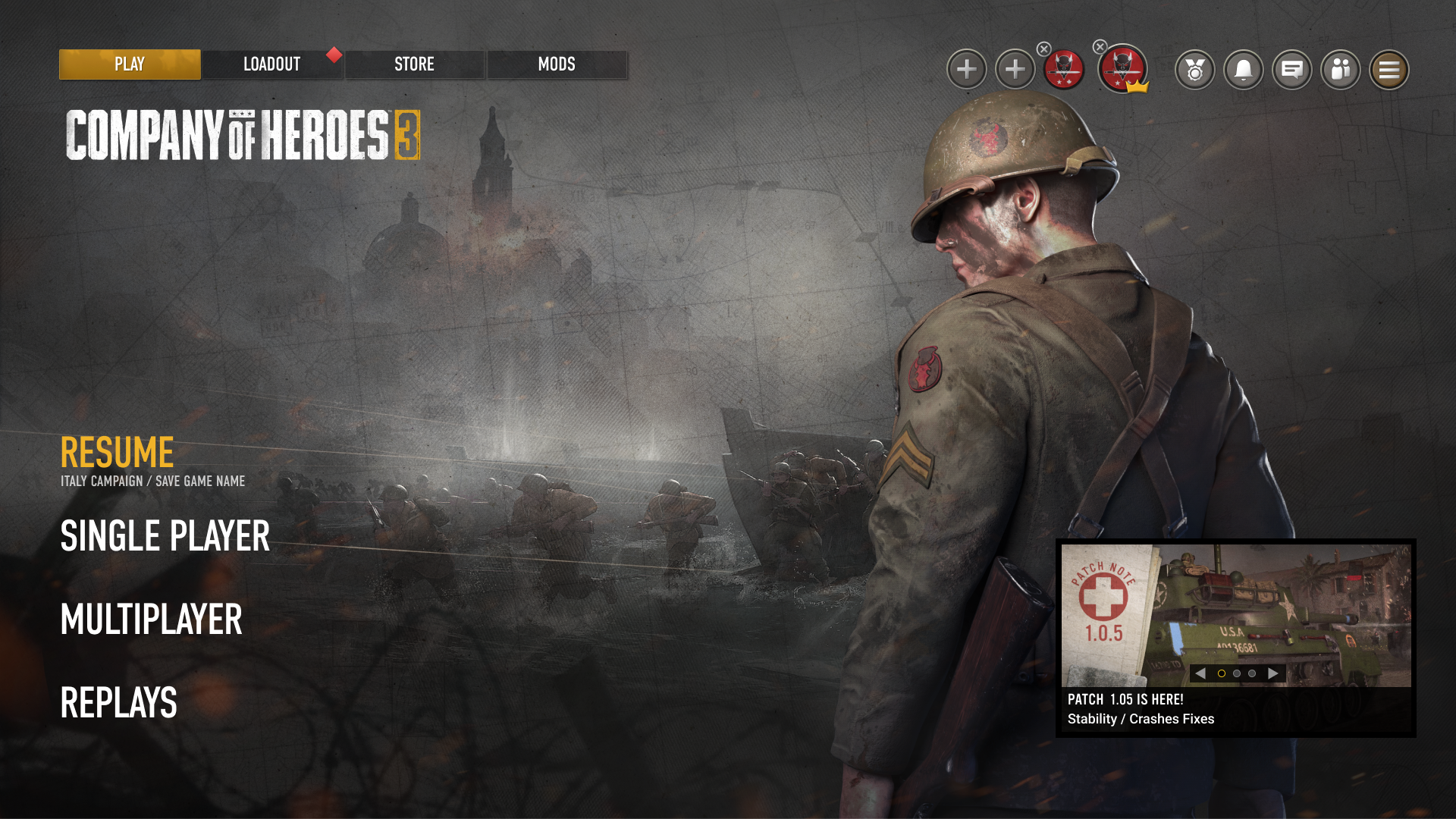
The launch of Company of Heroes 3 faced challenges, particularly due to various issues including sub-par UI/UX presentation and usability. Player reviews and community feedback indicated dissatisfaction with the game's UI presentation, which did not meet their expectations for a WW2 strategy game. Contrary to the launch version's illustration-based, bright, and saturated style, players sought a game menu that better aligned with popular cultural representations of WW2, characterized by more grim, dark, and rugged elements. The 1.4 Steel Shepherd update presented a valuable opportunity for the Company of Heroes team to directly address player feedback regarding the Front-End menu's presentation and usability.
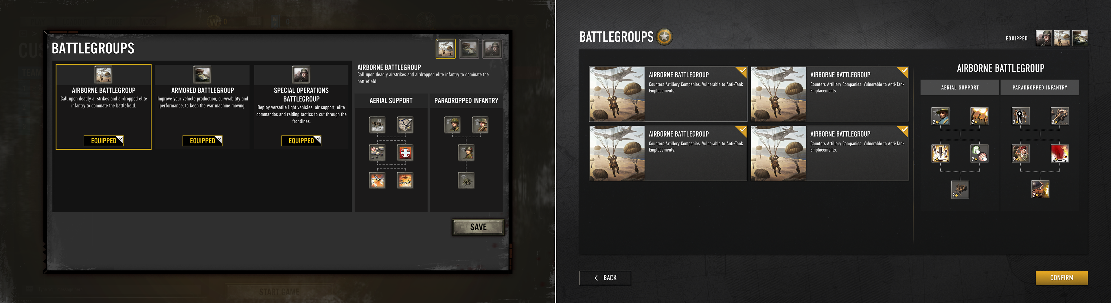
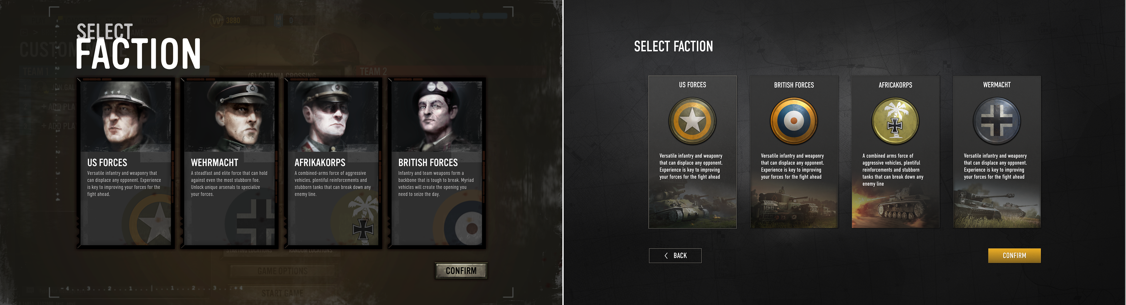
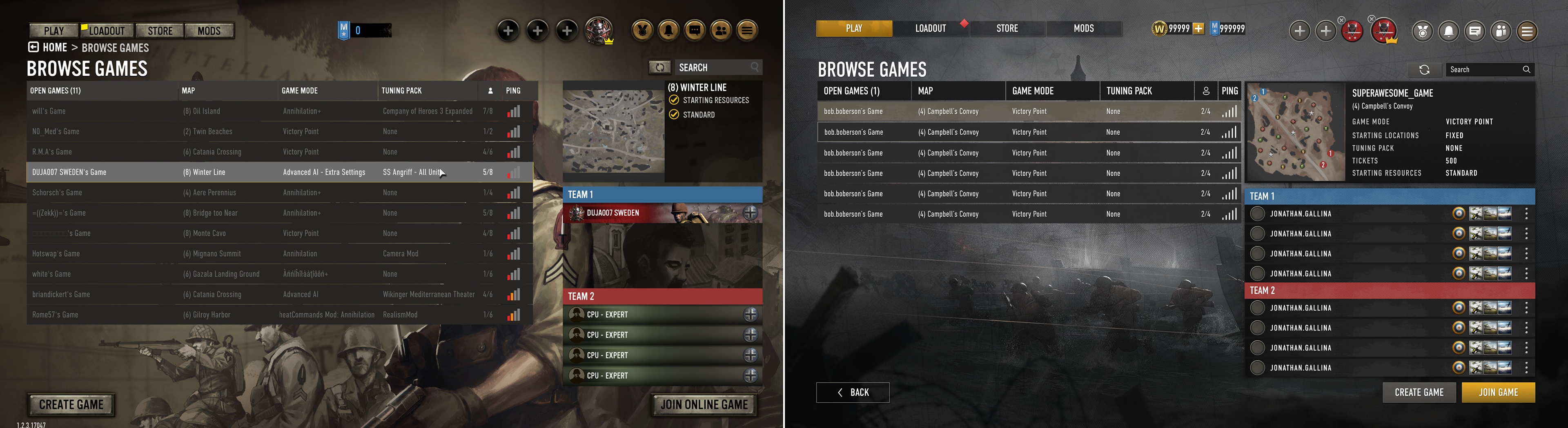
Information Hierarchy Changes
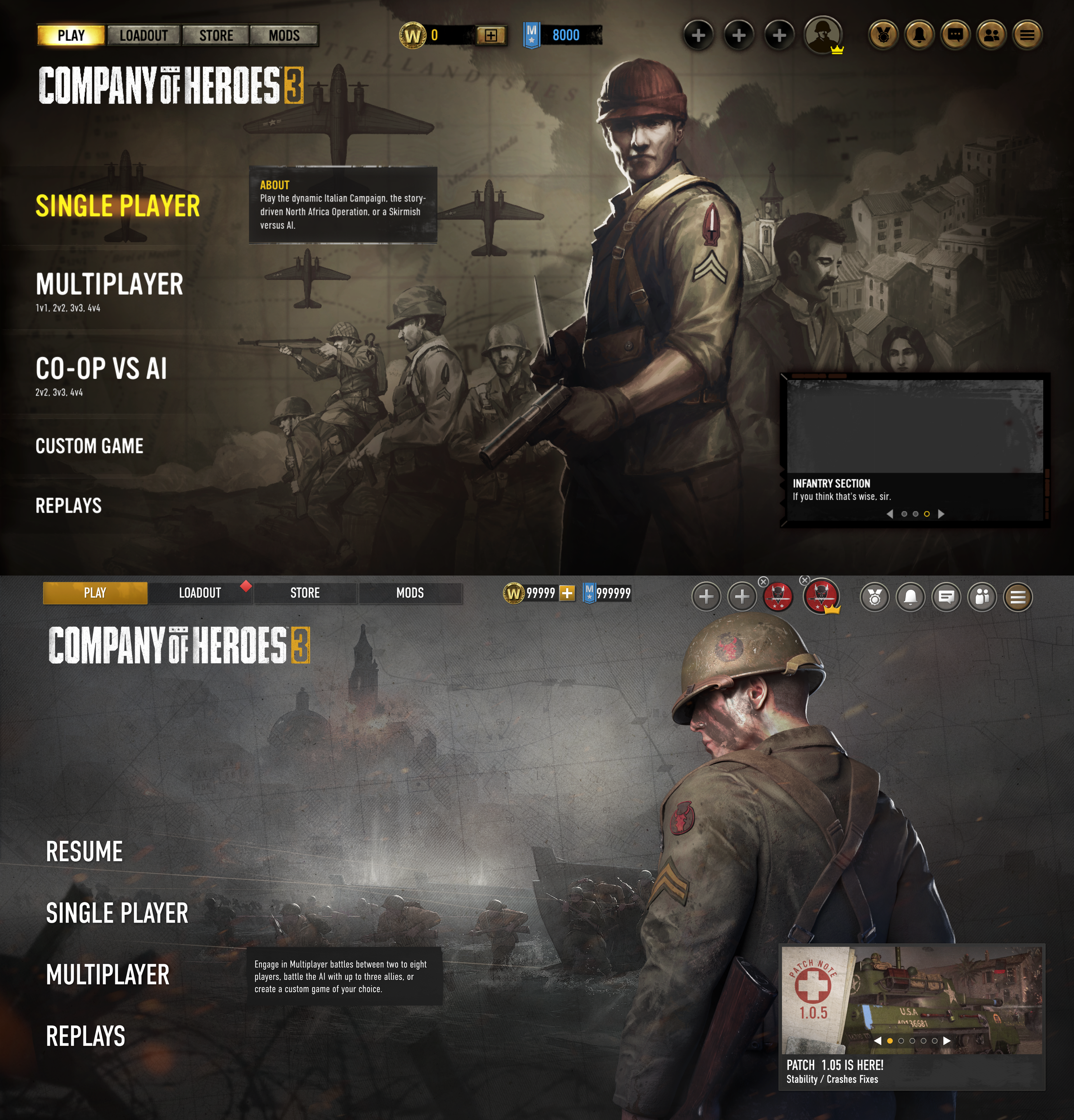
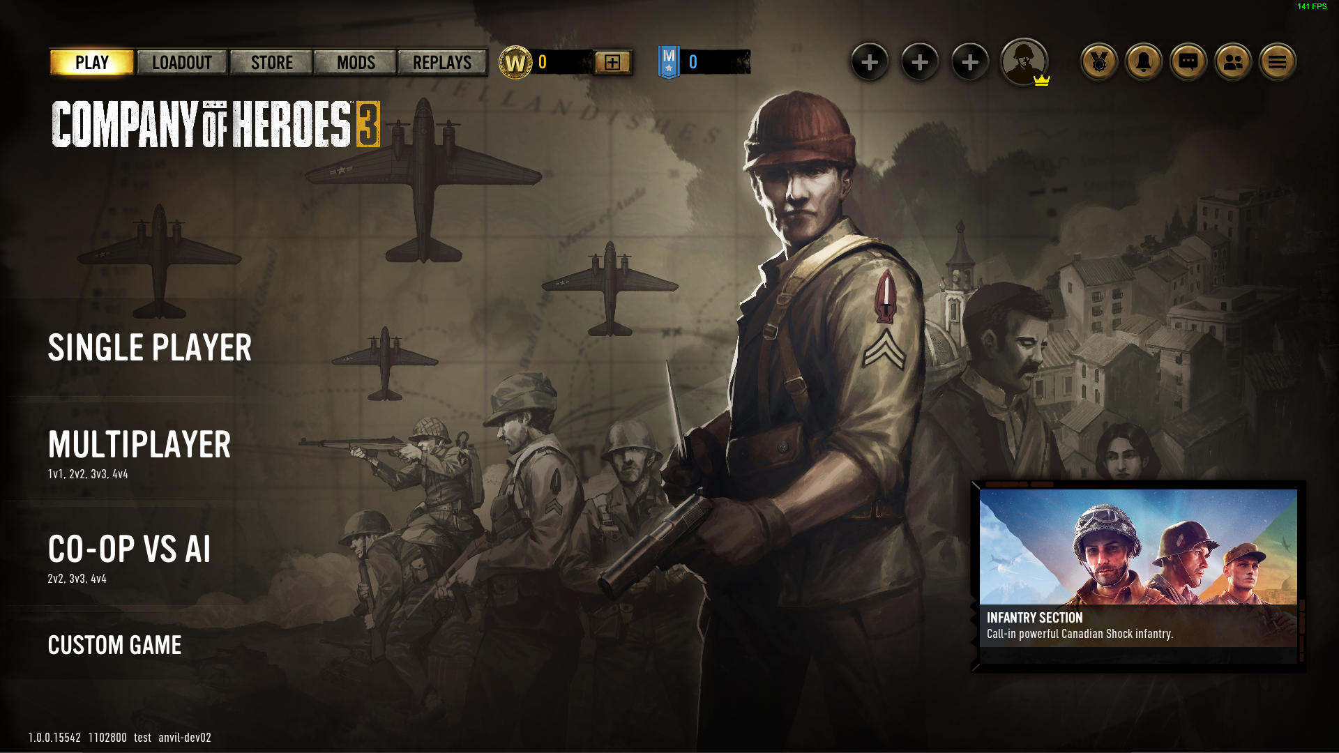
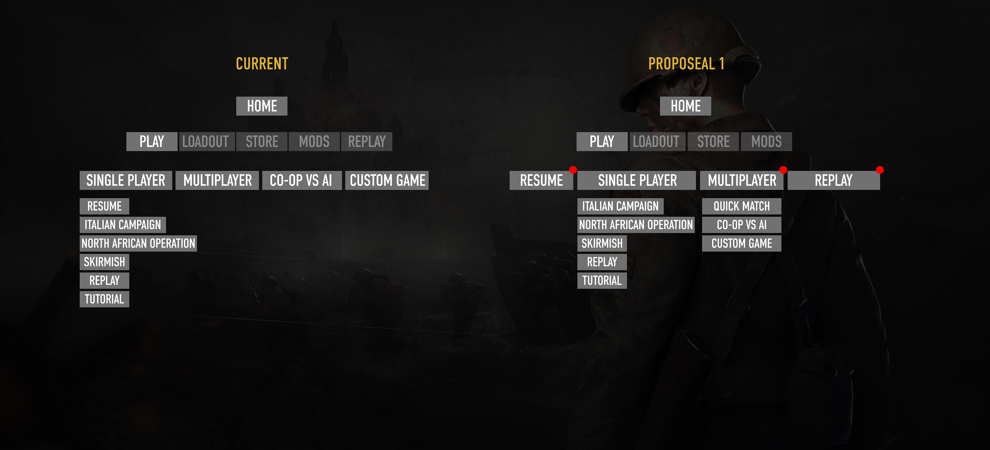
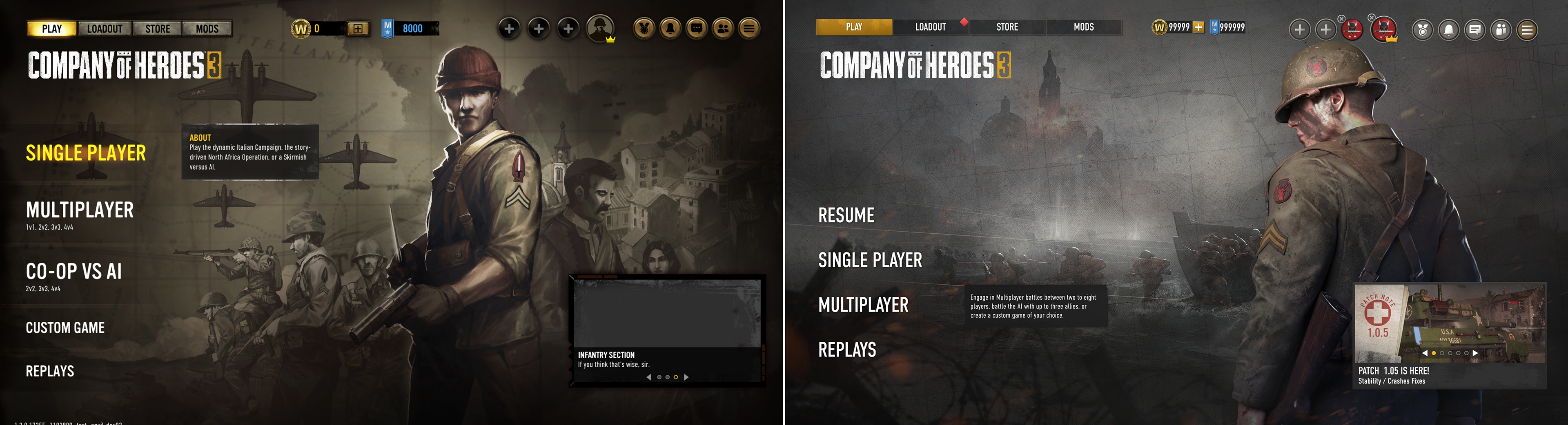
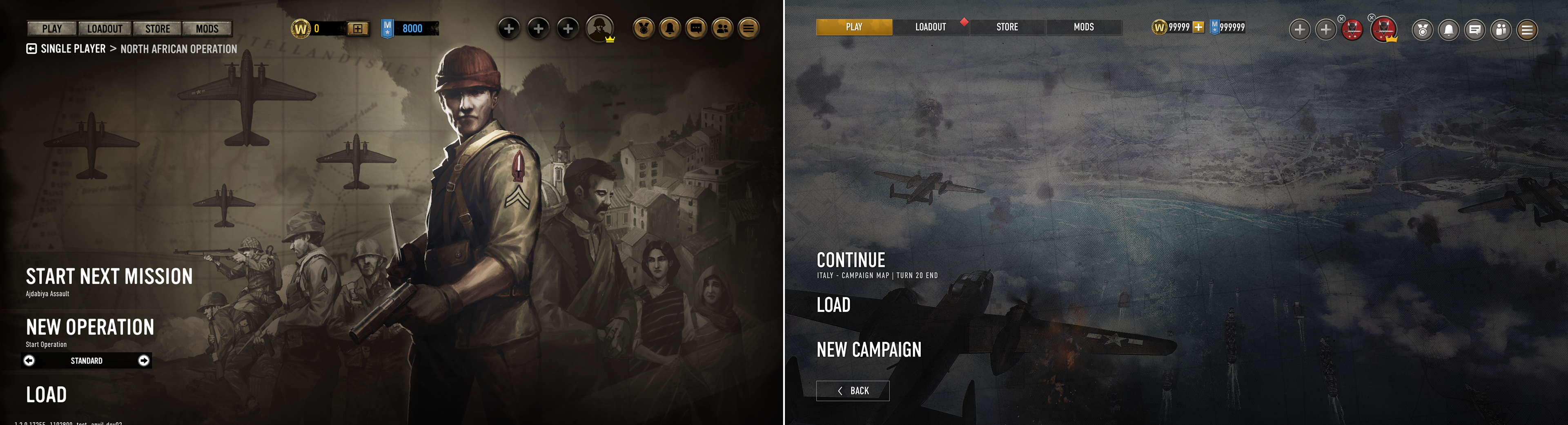
The first order of business is to address the confusing menus that players have been experiencing. By sorting out the Information Hierarchy (IA) on the Main Menu options, we can create a cleaner mental map that guides players into the game. The previous design had a non-standard hierarchy that failed to categorize different multiplayer modes under one entry point. Instead, it spread them across the Main Menu, while misleadingly naming Quick Match as "Multiplayer", which forced players to second guess about other modes.
In comparison, the updated design naturally categorizes all game modes under either Single Player or Multiplayer for easier understanding and navigation. Additionally, "Resume Campaign" is added to the top level for convenient pick-up and play.
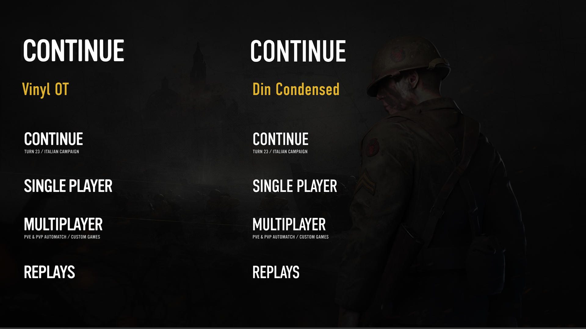
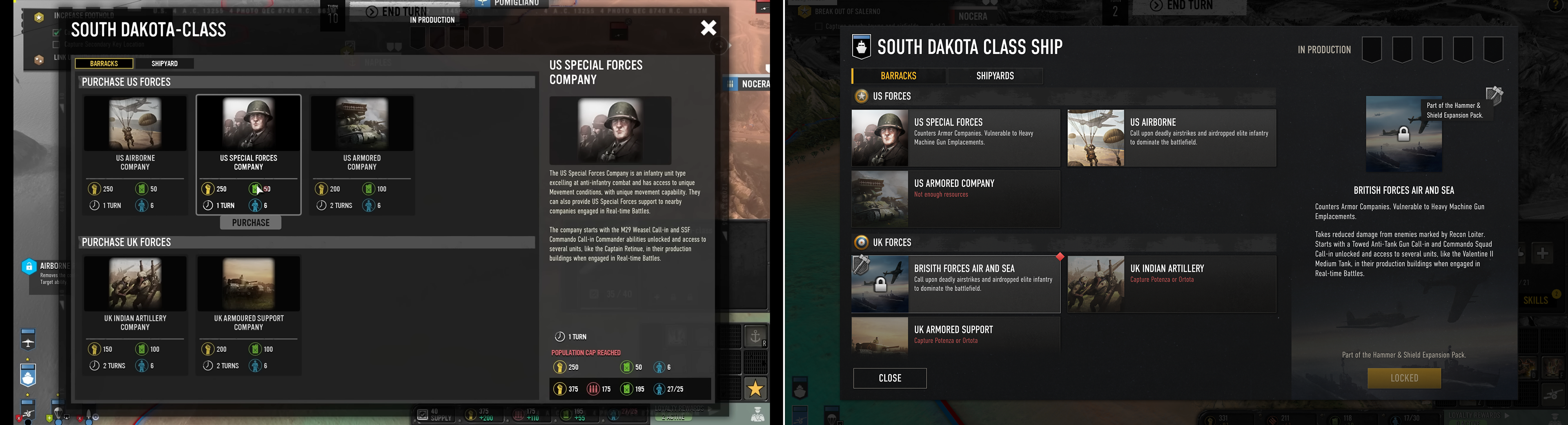
Font Change
While both Vinyl OT and DIN were used in the old design, Vinyl is primarily used in Headers and Sub-titles and delivered a softer presentation than we'd have liked. To make the game feel more modern and crisp we replaced it with DIN only across the game. The result was instantly recognizable after the update in game.
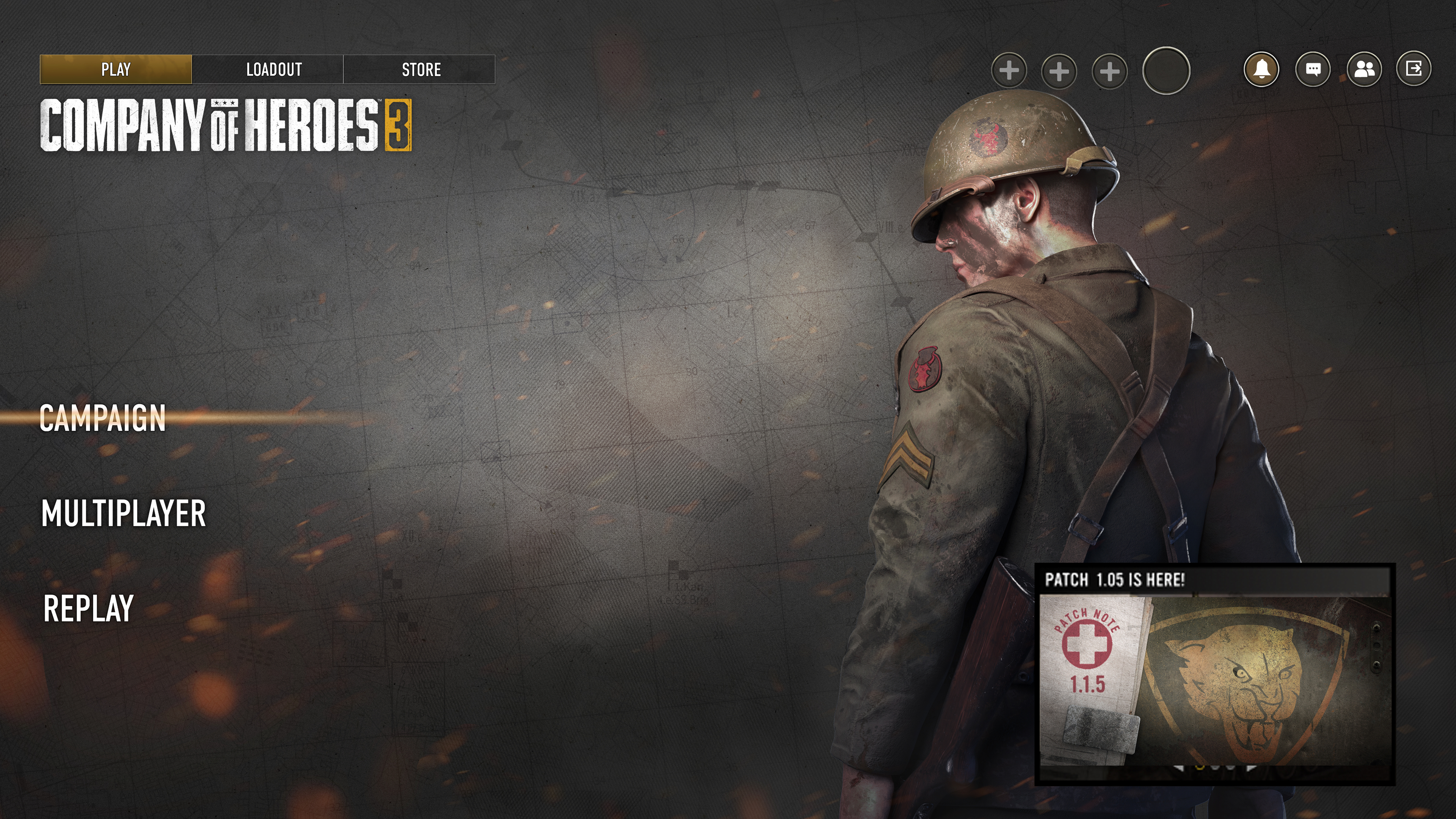
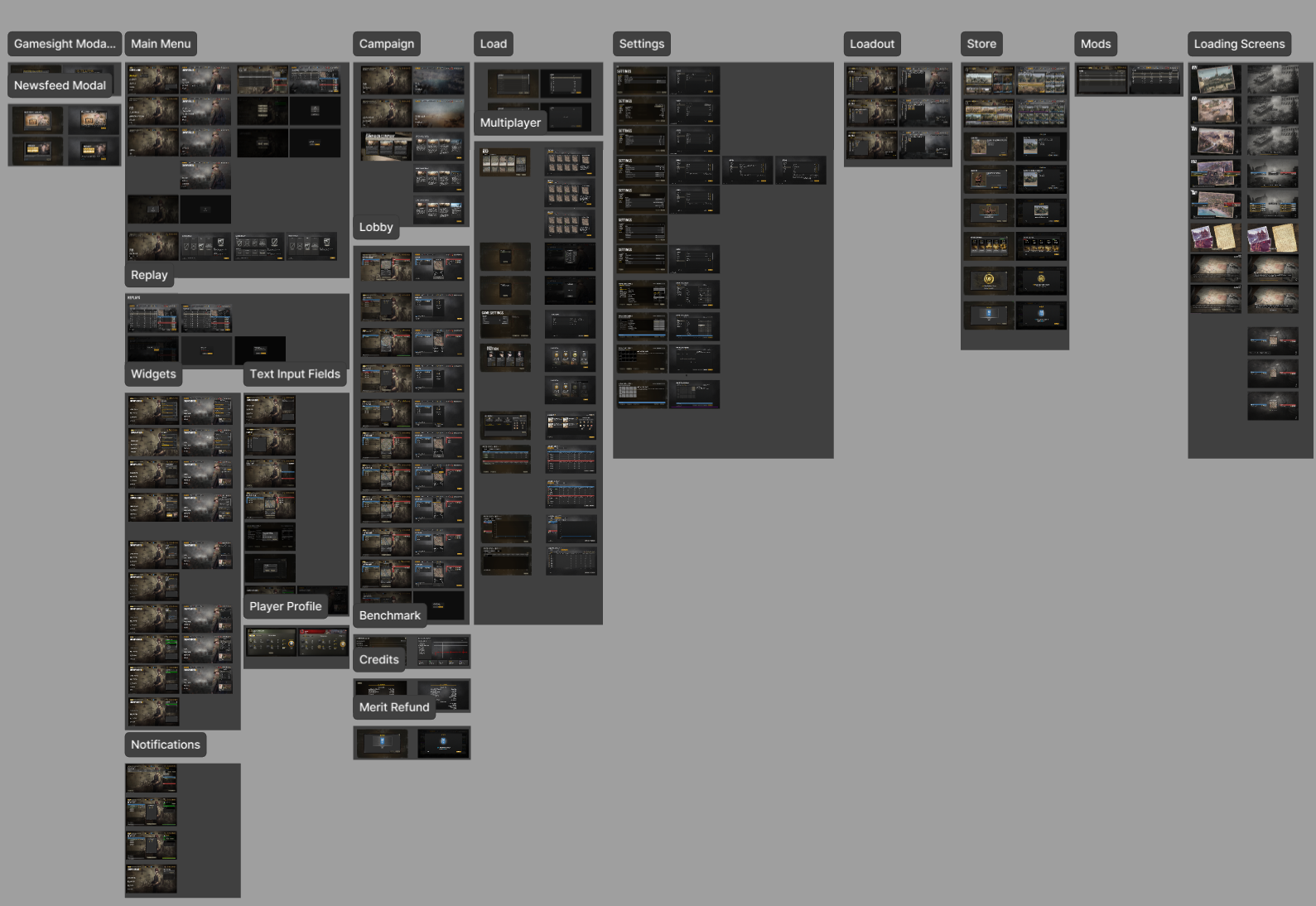
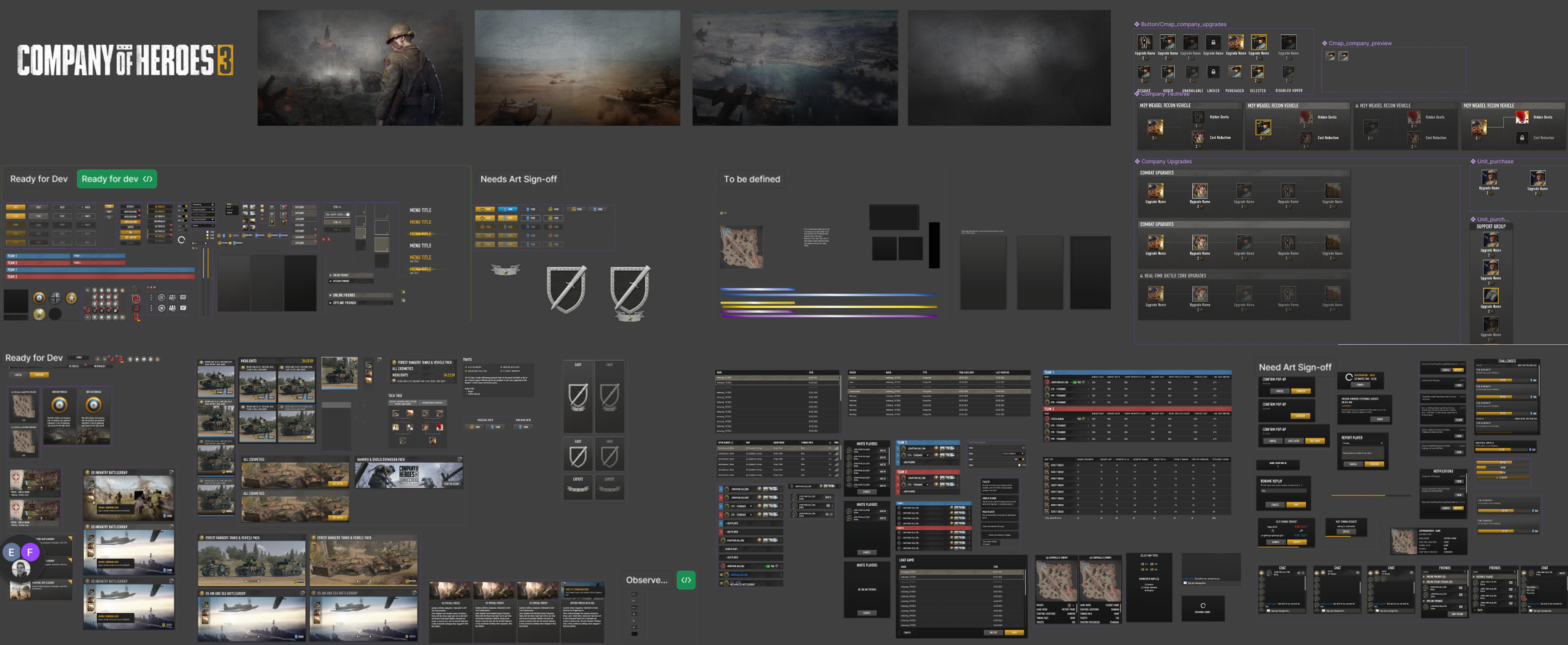
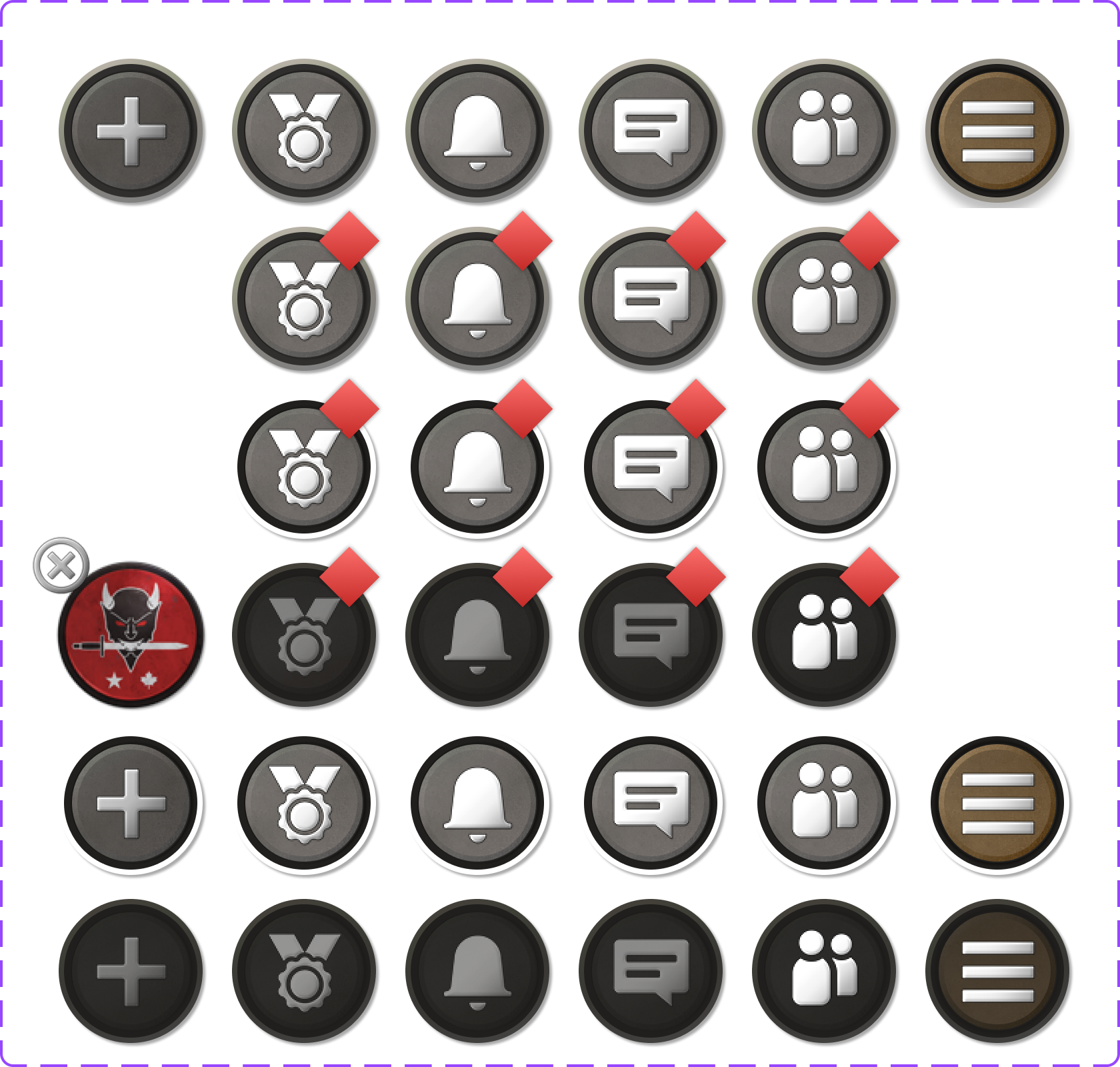
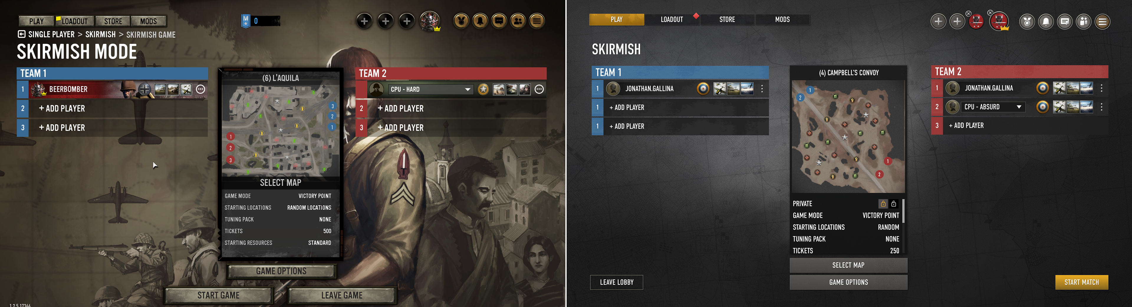
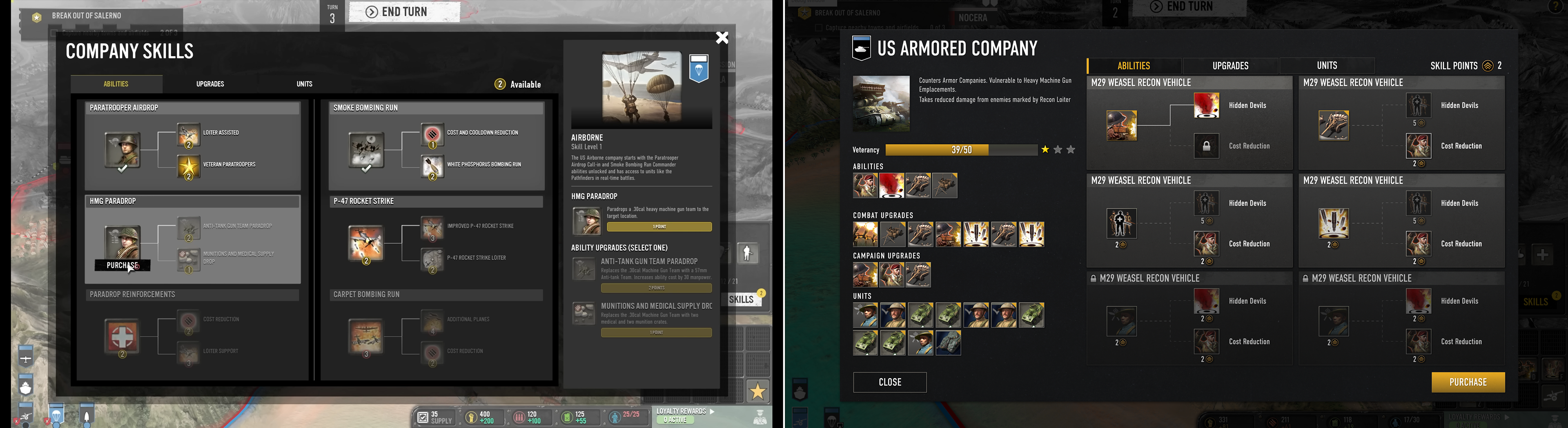
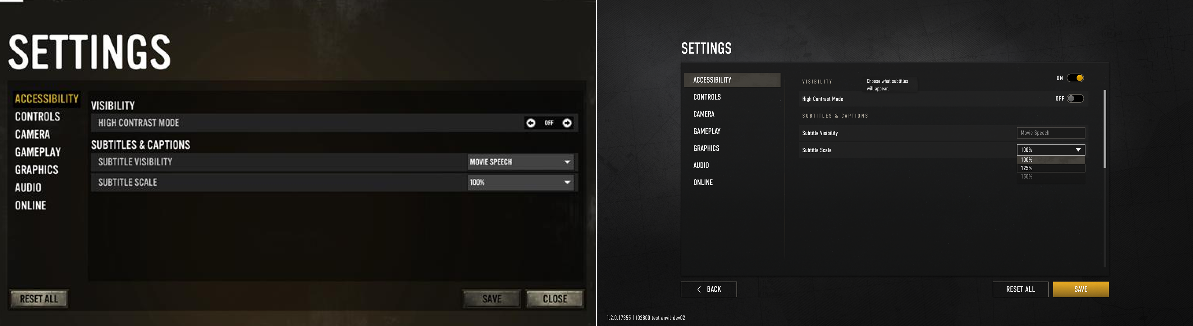
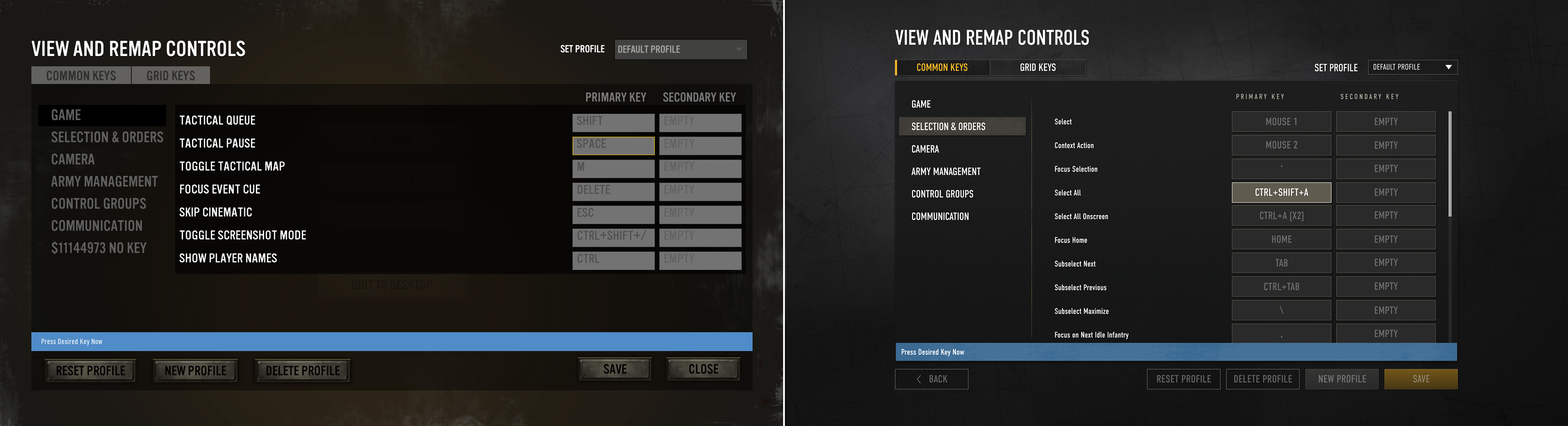
Momumental Reskin Effort in < 4 Months
Beginning with a Key Art to set the tone from the Art Director, the UIUX team was challenged to develop a new UI Style Guide in just two weeks, setting the stage for reskinning over 60 screens/states. Collaborating intimately with the UI Art team, we focused on experimenting with the game's golden path. Our goal was to retrospectively pinpoint themes and styles that could be consistently applied throughout the entire game. Key defining characteristics, such as clean, modern tactility, rapidly emerged as guiding pillars for our design approach.
A new era of Game UI development
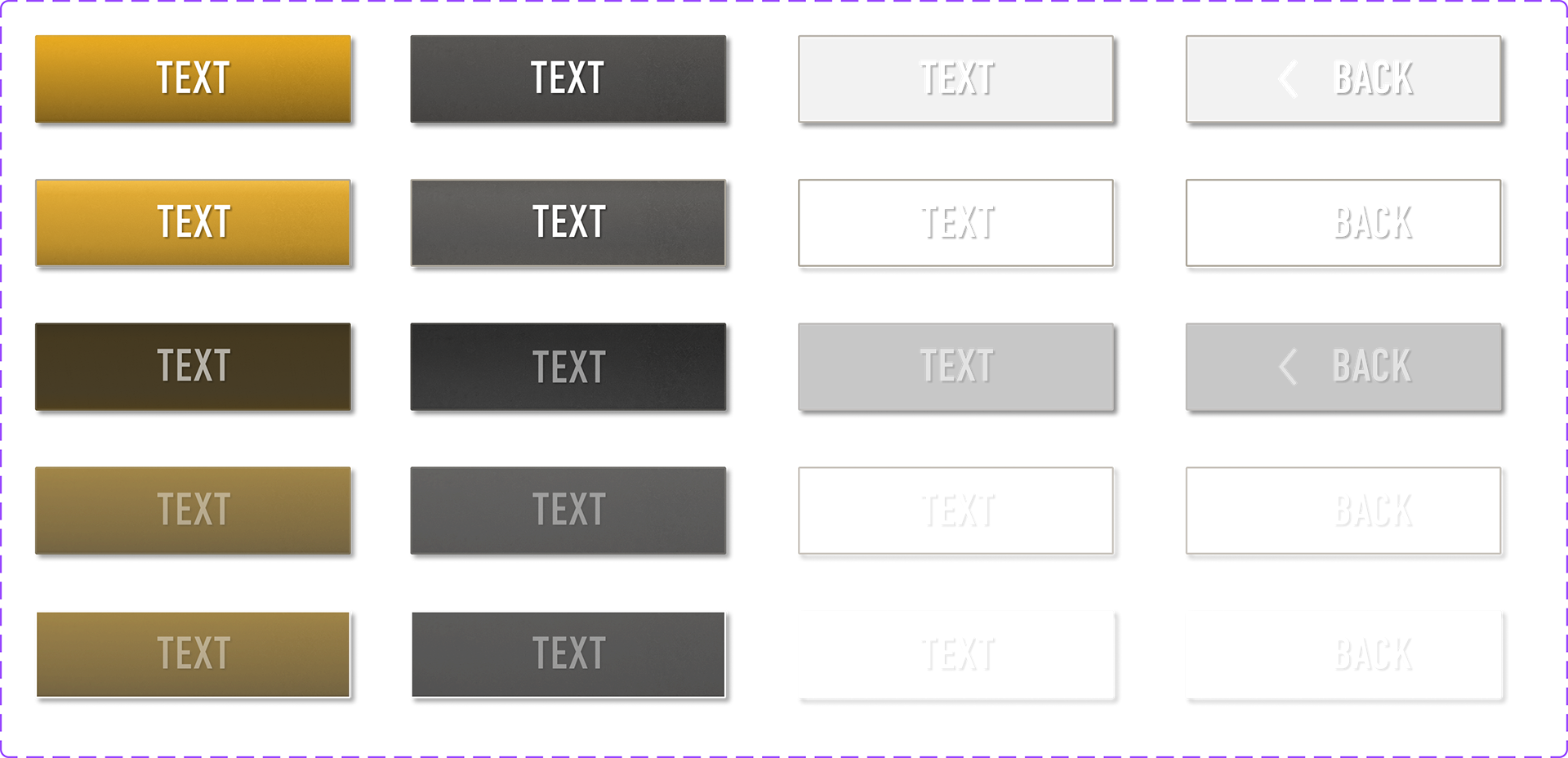
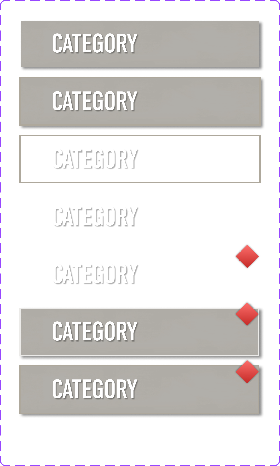
Along with updating the UI style, it was also crucial for the team to enhance the UIUX workflow. This was achieved by establishing a Figma component library, a tool not previously utilized during the game's development. Its absence had resulted in inconsistencies in the UI/UX and unpredictable workflows. Implementing this library proved to be a strategic success, greatly improving the efficiency and consistency of the team's approach to UI/UX development. Just like building with predefined Lego pieces, Design to Code has never been more fluid with the help of Figma.


Before and After Comparison
Community Sentiment on FE Menu Update


The 1.4 Front-end Menu Improvements have been very well received by players and community fans. Coupled with other in-game shader enhancements, the much-needed Front-End Menu update has significantly transformed the game's overall presentation and usability.
Although significant areas of the game, such as Path Finding, Balancing, and DLC offerings, need further attention from the developers to meet player concerns, updating the UI is undoubtedly a priority. Despite the considerable scale of the update achieved in a short timeframe, we anticipate more UI improvements and additional Quality of Life (QoL) fixes in future updates.